

Mobile & responsive design
MOBILE AND TABLET USEAGE ON THE WEB IS ON AN EVER
INCREASING TREND. THIS MAKES HAVING A RESPONSIVE WEB
DESIGN IMPERITIVE.
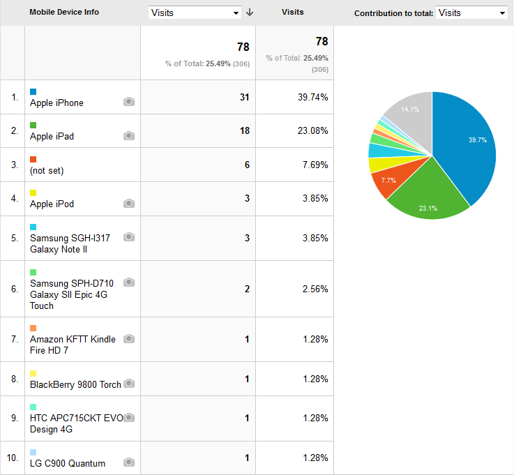
25% of this customer's website visits are now coming on either mobile phones or tablets. This mobile usage information comes with the statistics offered by Moonware Design.
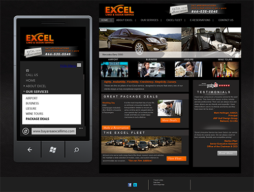
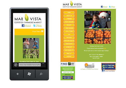
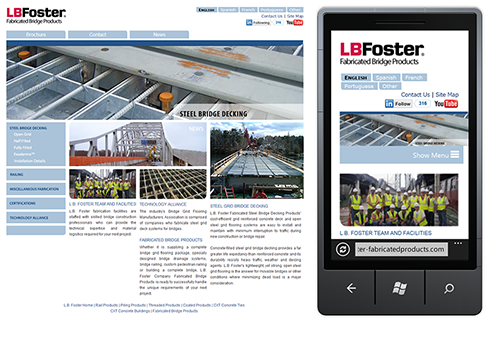
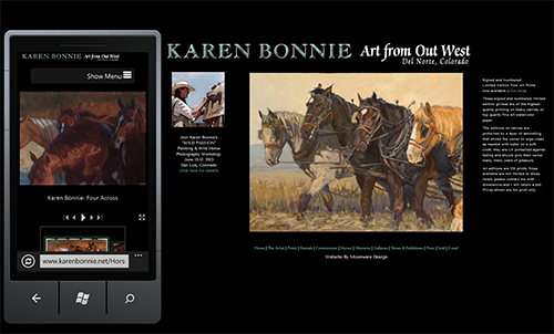
Moonware Design creates responsive web designs that adapt to the screen size of both smart phones and tablet computers. When clicked with a smart phone, the phone numbers bring up the dialer.
Menus, columns, images and text are all in fluid layouts so that they fit the various screen sizes by using specialized style sheets that query the browser.
We can often adapt the style sheets used in your current website design in order to make your site a responsive site, and if not, likely you are in need of a re-design effort!
Call us and we'll be happy to explain further.
Cell phone : 707 849-5236